Client:
Rodan + Fields
Account Cancellation
View Live Version
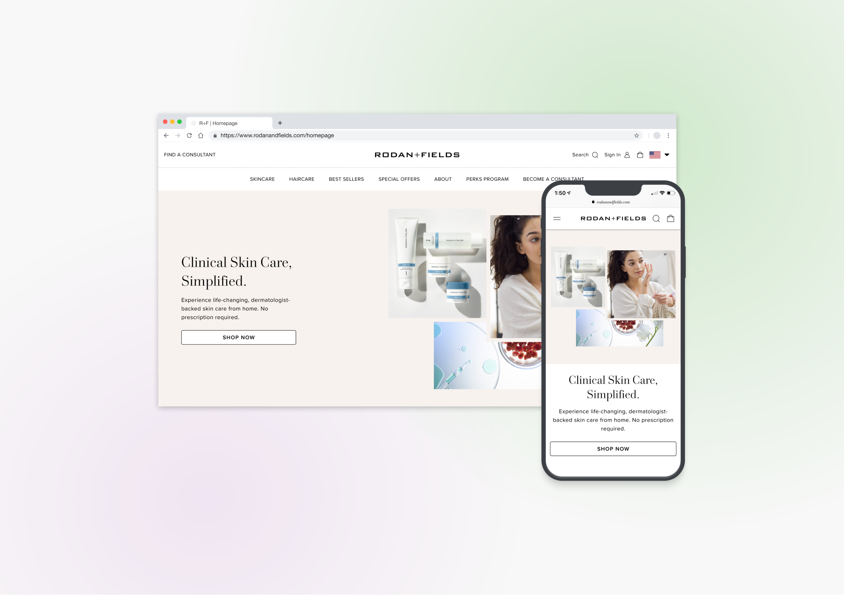
Rodan + Fields
Year
2023
Scope of Work
Product Designer | Website Design
Location
San Ramon
Rodan + Fields is a dermatologist-inspired, clinically-tested skincare and haircare brand. Their e-commerce platform has four types of users - Anonymous, Retail Customer, Preferred Customer, and Consultant - shopping for skin and hair products. The user journey for each user type offers different affordances and discounts. By providing a range of perks and discounts, Rodan + Fields website aims to educate its users about its programs, drive adoption, and improve account retention, leading to recurring product purchases.
The Problem
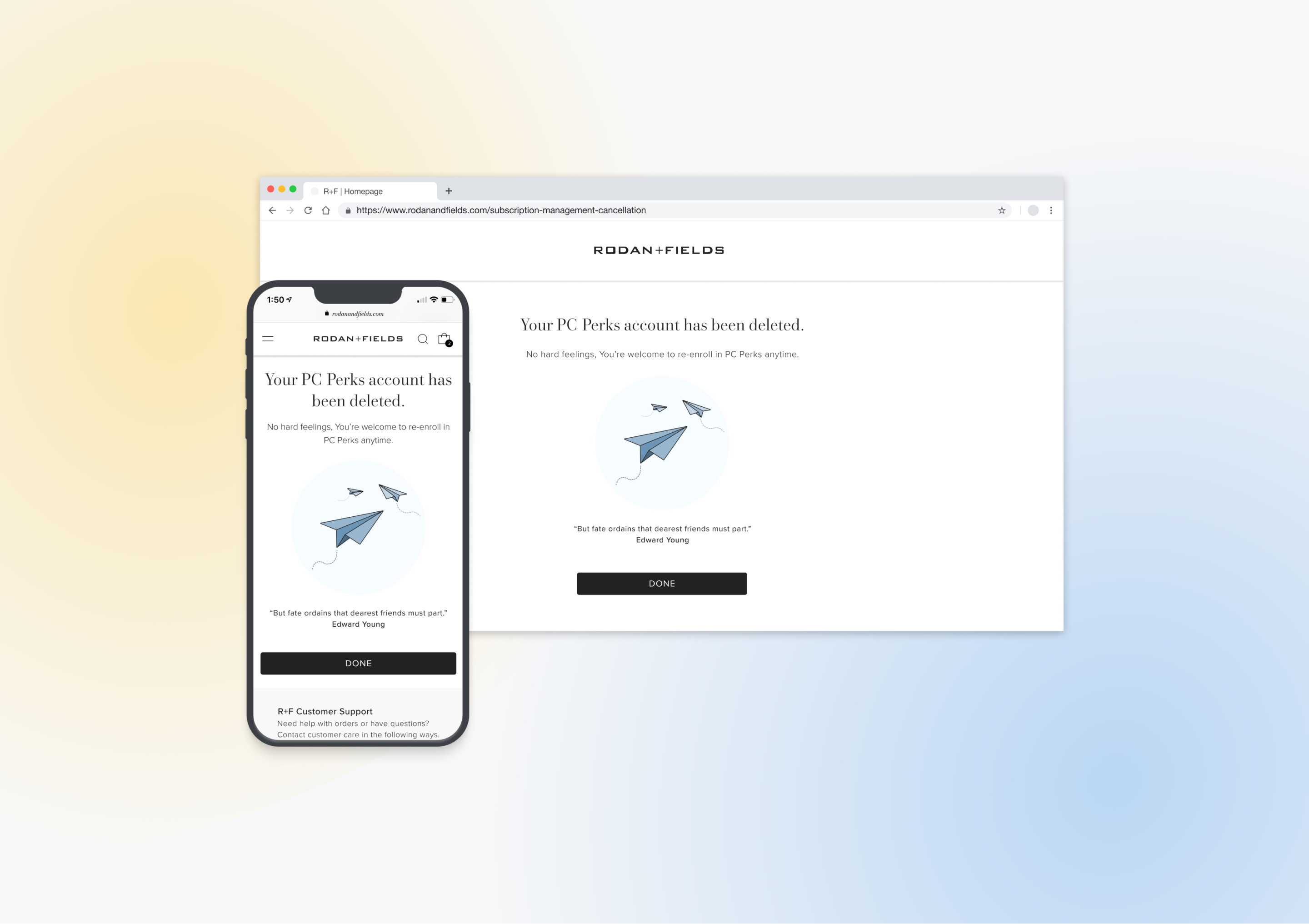
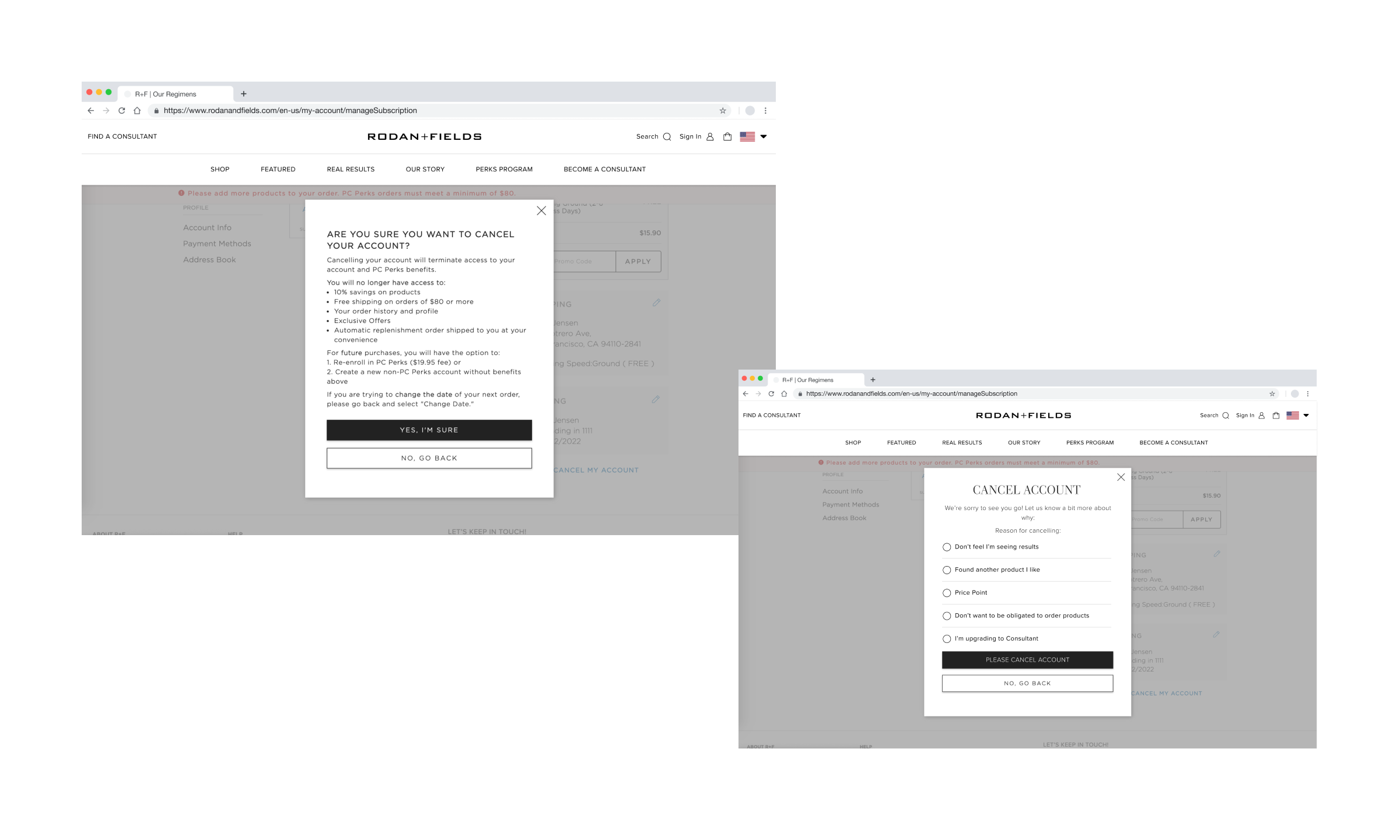
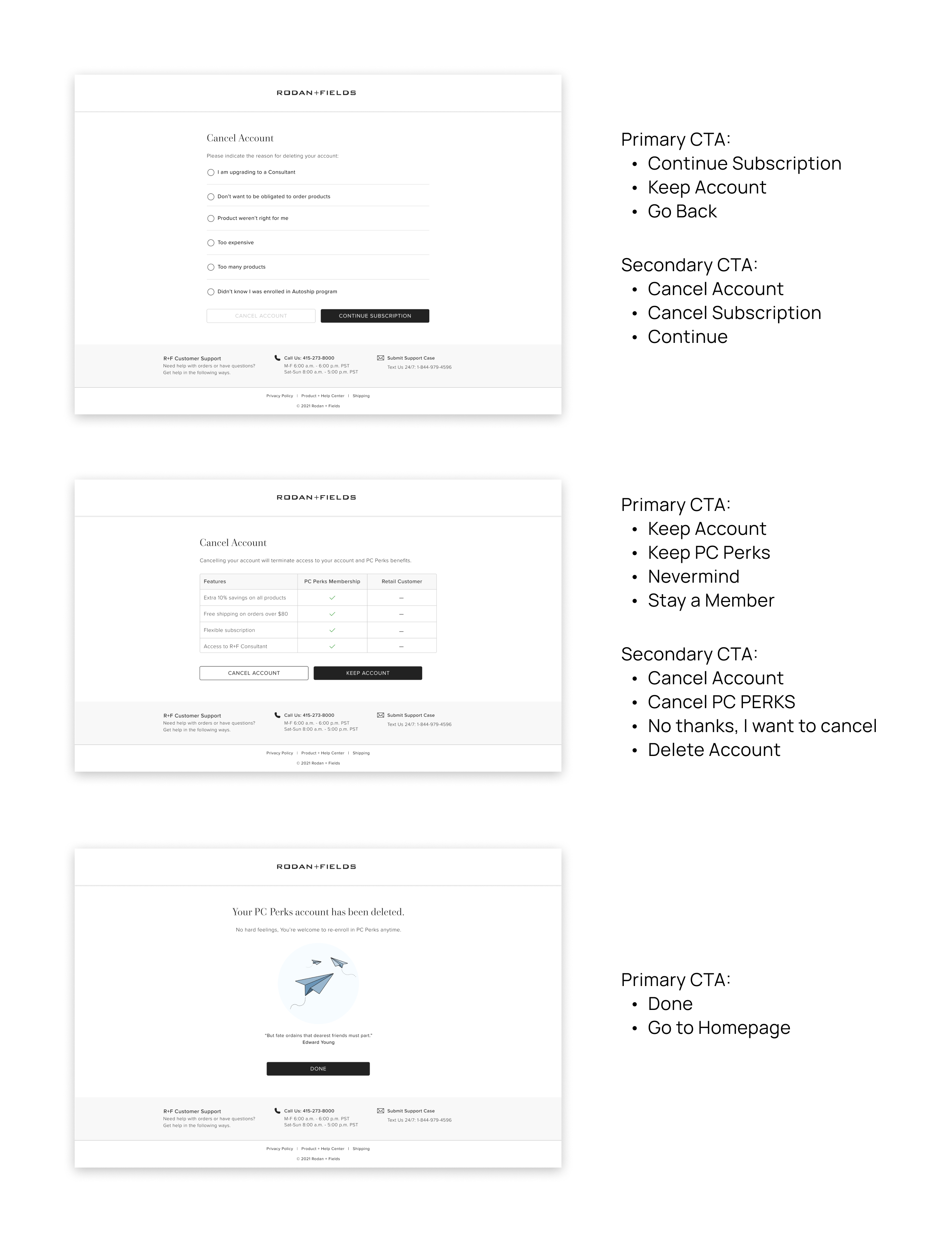
Preferred Customers, subscribed members, were terminating their accounts at a rate of 4.1%. The two-step cancellation experience did not communicate to the users that canceling their PC subscription would wipe out all the data associated with their account.
Challenges
- Help users understand what it means to cancel a PC account
- Provide the ability to find alternative solutions to address users’ needs
- Delay account termination
- Use comprehensive language
Research
Problems discovered during user interviews to research comprehension and language showed PC users needed clarification about the terminology used with the cancellation flow. PCs thought they could order again from Rodan + Fields even though they canceled their subscription, “like Amazon.”

Key Takeaways
- The terminology used in the cancellation flow did not resonate with users
- Users were unclear about which benefits they would lose; they did not know clicking “cancel subscription” would delete all their data
- Easy to cancel
- Users were accidentally choosing to cancel when they wanted to delay orders instead
Ideation
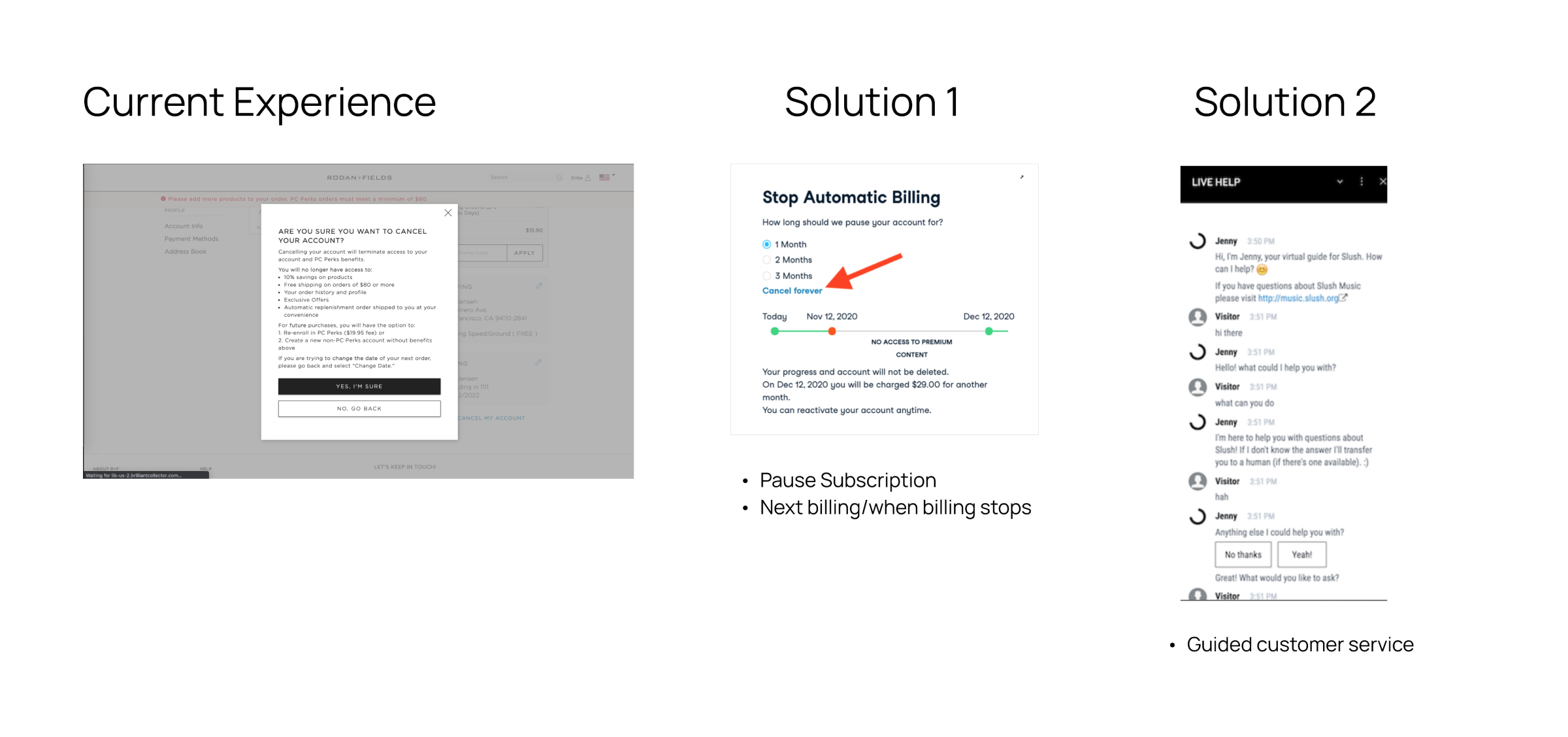
Based on the user and market research, I collaborated with the Product Manager and another designer to brainstorm ideas to improve the cancellation experience. We proposed reducing the PC cancellation funnel entrance by removing the Account Cancellation module from the My Account page to address casual cancellations. Furthermore, we wanted to test new terminology for the user flow and add two new features to help users understand how to achieve their needs.

New Features
Pause Subscription: Users who want to postpone their subscription order may not know how to use the feature on the Subscription Management page. A Pause Subscription feature in the cancellation flow would help users quickly delay their next order and continue their membership.
Customer Help Guide: Users have concerns about their accounts and need help knowing where to get solutions. Providing users with an assistant feature can help users address their issues.
Design Exploration
Our team began to explore design iterations through the framework of creating an experience in which users have one pathway to cancel their account; and be able to choose to delay their subscription, get account assistance, and understand the benefits they would be losing.
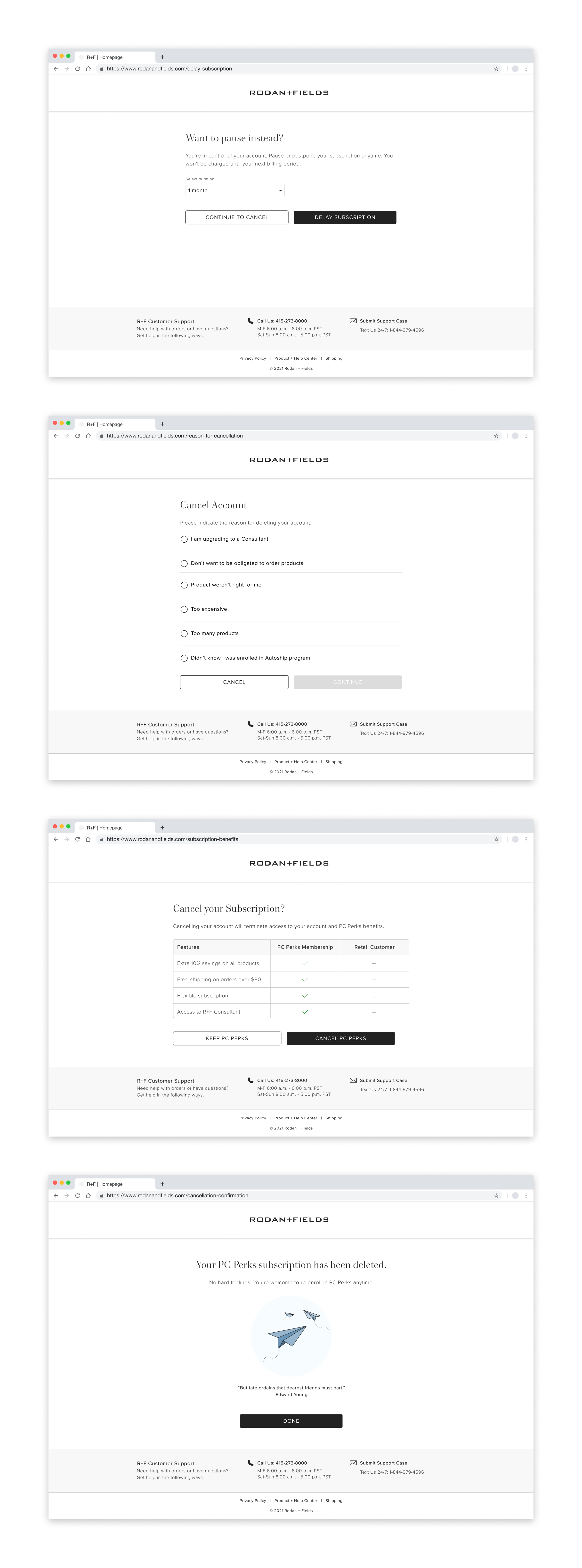
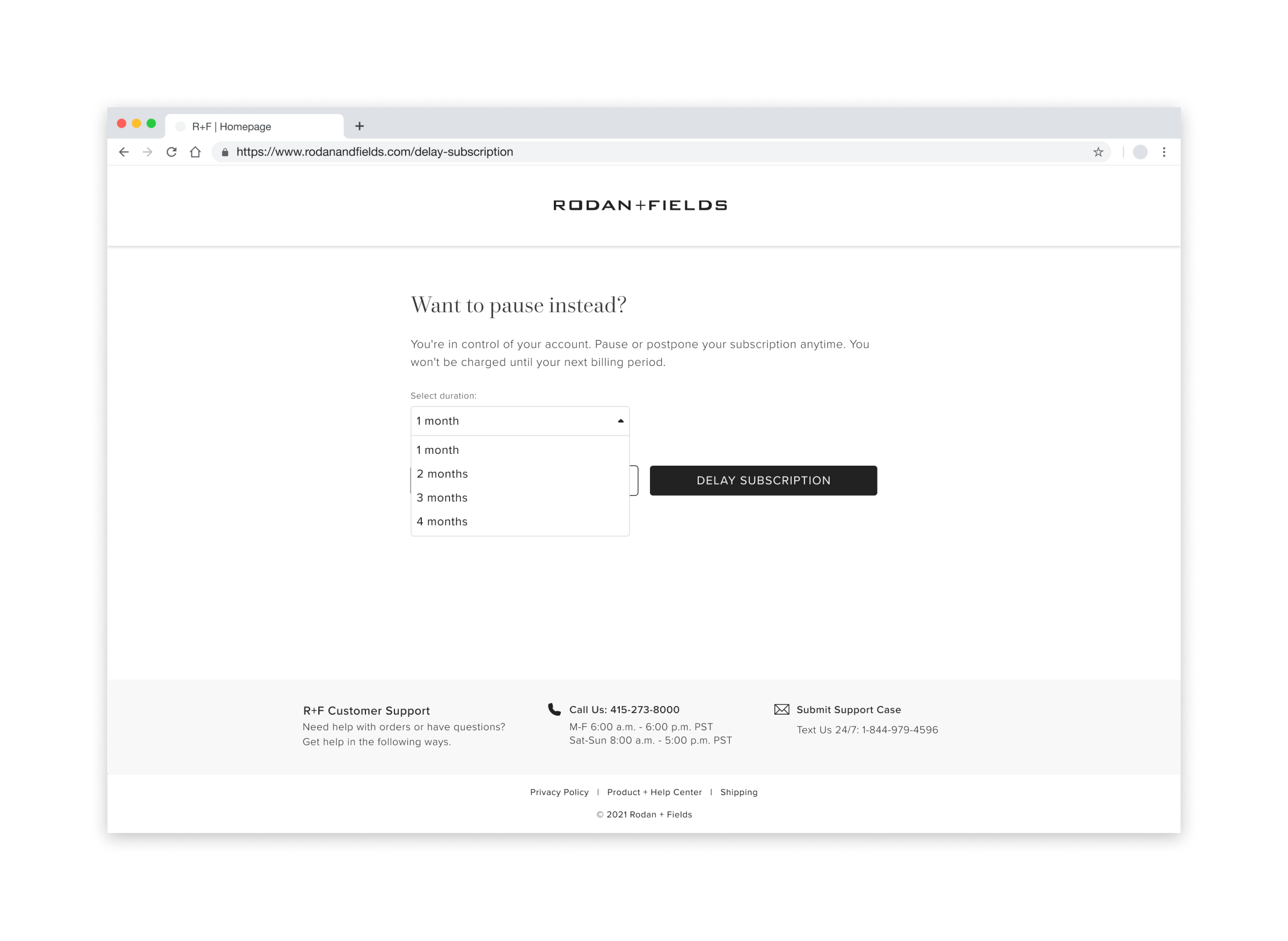
Delay Subscription
Because users were frustrated by recurring orders and may not know how to delay their subscriptions, we created a page to help them quickly delay their subscriptions and exit the cancellation flow. Users can push out their subscription for up to 4 months.
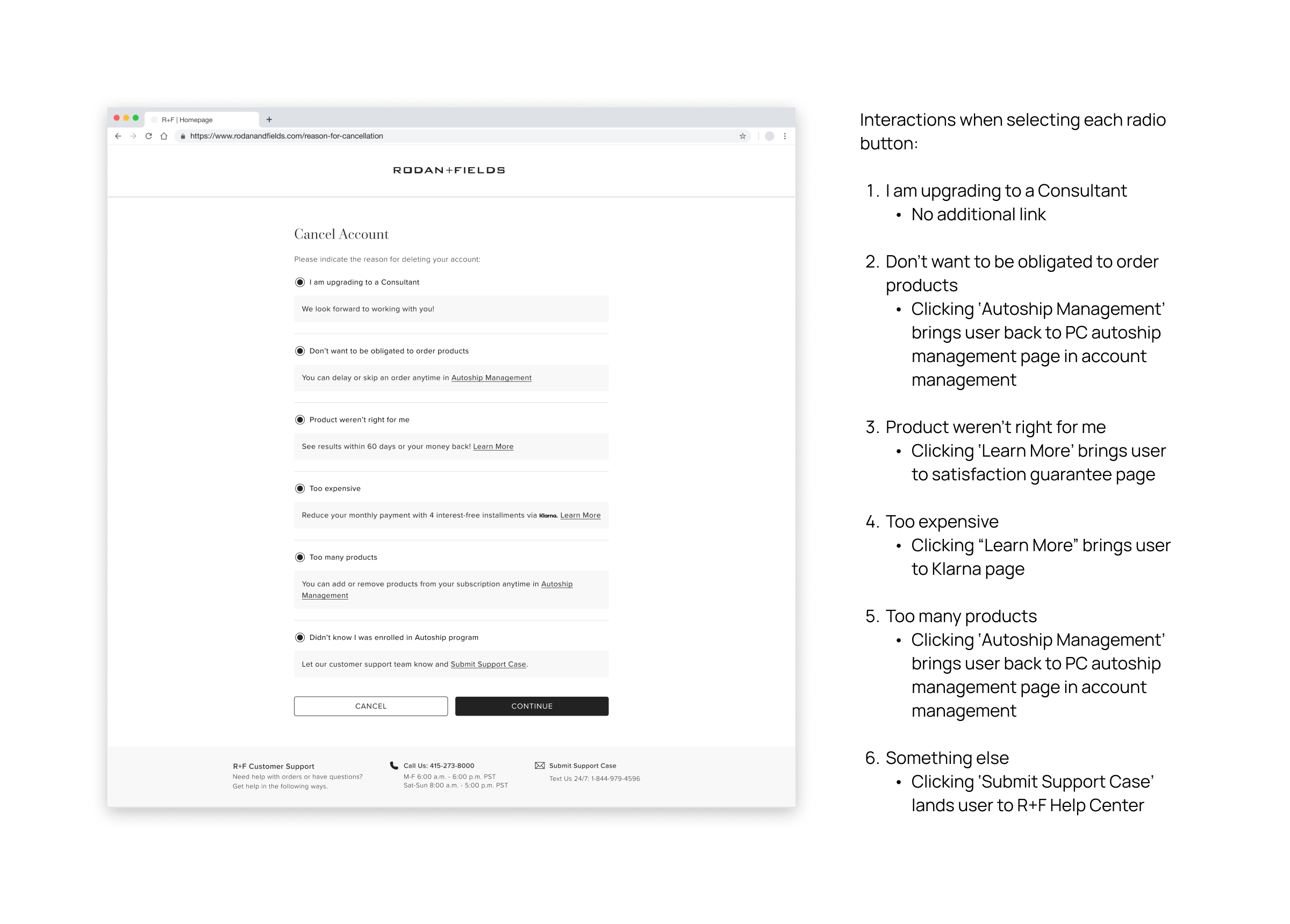
Help Guide
We leveraged responses from the legacy flow's cancellation reason survey to inform us how to assist users before they choose to terminate their accounts. For each issue listed, we created responses and pathways to help resolve the problem for users and exit the termination flow.
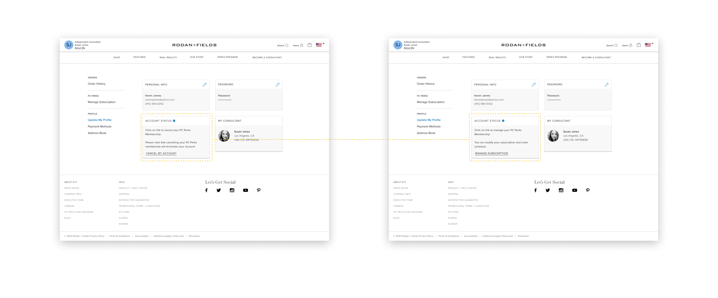
Reduce Cancellation Entry
We identified that 25% of users were canceling their account through the My Account page entryway, which is not the primary page for account cancellation. We hypothesize that removing this funnel entrance will discourage casual cancellations. We updated the content in the “Account Management” module to link users to the Subscription Management page, where users can access the account cancellation flow.
Usability Testing
We released the new experience and A/B tested it against the old. We also tested our hypothesis to remove the cancellation pathway on the My Account page.
- Dividing users into two groups, we showed the control group the old cancellation flow, and the other group saw the new experience.
- We did a 50% spit with existing PCs and set the control group to see the “Cancel My Account” button while we hid the Account Management module from the second group
Testing Results
The A/B test for the new experience did not produce the desired outcome. Users were still canceling at the same rate as the old flow. We identified a few design flaws -- button treatment, copy, and location were leading users to cancel accounts. Based on these findings, we updated the design to reduce the prioritization of cancellations and used different terminology in the flow. These changes improved the cancellation rate with the new flow and helped it outperform the old experience. In a second A/B test, removing the Cancellation button from the My Account module reduced PC Cancellation by 16.5% in controlled testing across 41,000 sessions. Based on the result, we recommended updating the content and button in the “Account Management” module to link users to the Subscription Management page, where users can access the account cancellation flow.