Client:
Rodan + Fields
Web Design
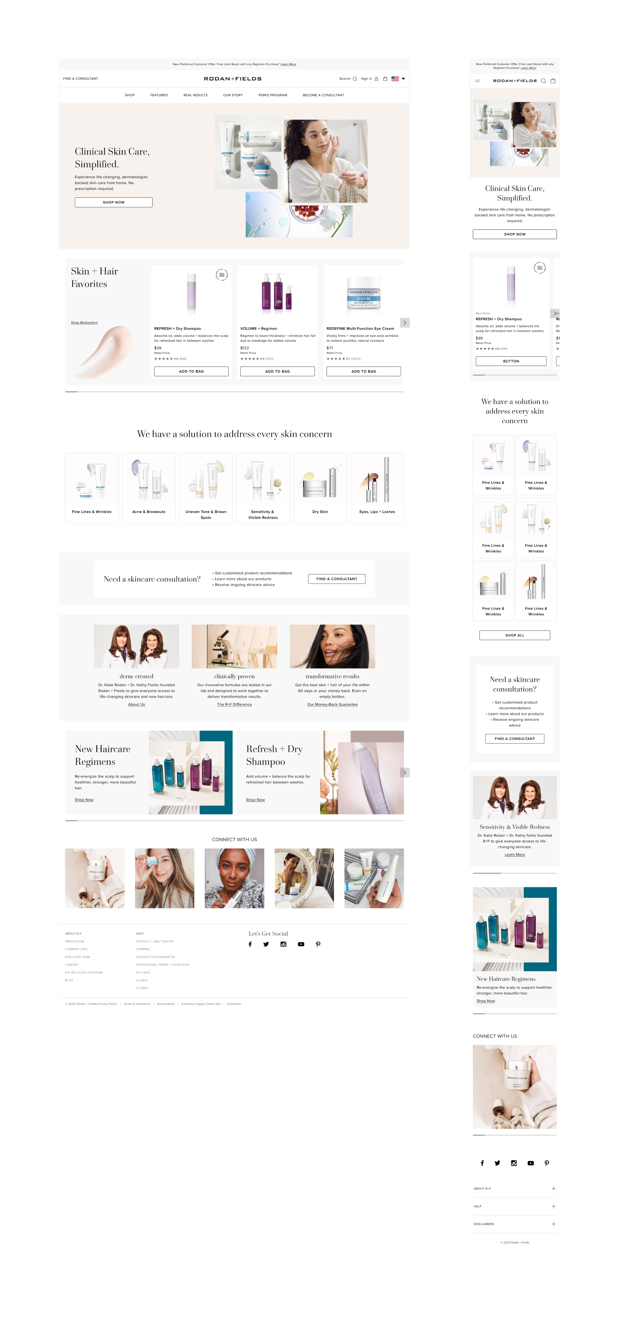
Homepage
View Live Version
Rodan + Fields
Year
2021
Scope of Work
Product Designer | Website Design
Location
San Ramon
Rodan + Fields is a dermatologist-inspired, clinically-tested skincare and haircare brand. Their e-commerce platform offers individual products and kits for customers with skin and hair concerns. Overall, the Rodan + Fields website aims to provide a user-friendly and seamless shopping experience for their customers and independent contractors. The platform aims to enhance product discovery and empower users to make informed purchase decisions.
The Problem
Customers want to see a homepage that is memorable, compelling, and simple to navigate. Instead, the homepage has become a static, disjointed feed of sometimes competing messaging that does not give customers clear guidance on where to engage.
Challenges
- Prioritize product value prop or offerings
- Provide benefits in the product description
- Mobile first
- Provide clear calls to action
Research
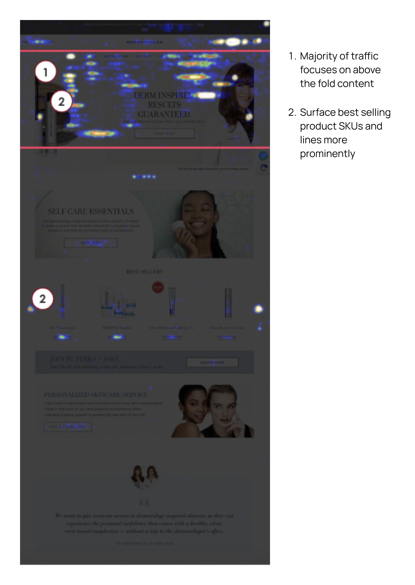
The homepage heatmap showed that most user traffic focuses on above-the-fold content, and fewer than 50% of visitors scroll below the fold - an opportunity to A/B test creative in above the fold carousel and refresh content. This also indicated that the best-selling products should be more prominently featured. The homepage did not highlight top-selling product lines but hid them within navigation.
Key Takeaways
- Prioritizing key messages and product offerings will allow users to explore product offerings and find the right product(s) for them.
- It is important to communicate the benefit of the product concisely. The product cards need to have more information about the benefits or concerns the product is addressing.
- Surface bestsellers, new arrivals, and promotions.
- Multiple banners are competing for attention, and there needs to be clear guidance on where to start, discover products, or connect with a consultant.
Feature Workshop
Rather than prioritizing features, we categorized them into high-level user scenarios based on user personas. At R+F, there are four types of users: anonymous, retail customers, PC (Preferred) customers, and consultants. We bucketed the user types into two persona groups: new users (anonymous) and returning users (RC, PC, and Consultants). By doing so, we could group content blocks into primary and secondary sections, which helped us focus on key content for each user type.
Data Analysis
New users: Users known as “Trendsetter” tend to shop by product type and are not looking for a regimen. They are interested in what is new and don’t want a relationship with a consultant sponsor. Whereas “Loyal Solution Seeker” users look for what is proven to work, like to shop by concern, and are more willing to purchase a regimen. A Loyal Solution Seeker might be willing to work with a consultant.
Returning users: Trendsetters tend look for key ingredients and shop by product type or concern. They are not interested in regimens or connecting with a sponsor. Loyal Solution Seekers believe in expensive skincare and look for trustworthy brands. They shop by skin concern and will shop for regimens.
Design Exploration
Our team created a plan to enhance the parts of the homepage that needed improvement based on the research results. We held idea sketching workshops in which multiple team members simultaneously thought about each of the items that needed improvement and tried to produce the best UI sketch. We repeated this for two rounds and then had a vote to decide the design direction with everyone’s opinion included.
Information Architecture
After the team had narrowed down the key features, we began to build the design by organizing modules based on user type. This feature list helped reduce scope creep and became our “source of truth.”
From Sketches to Wirefames
We used the UI sketches as a stepping stone to create the wireframes for each module. To ensure the modules are scaleable, we wireframed mobile breakpoint and then translated it to desktop.
Visual Translation
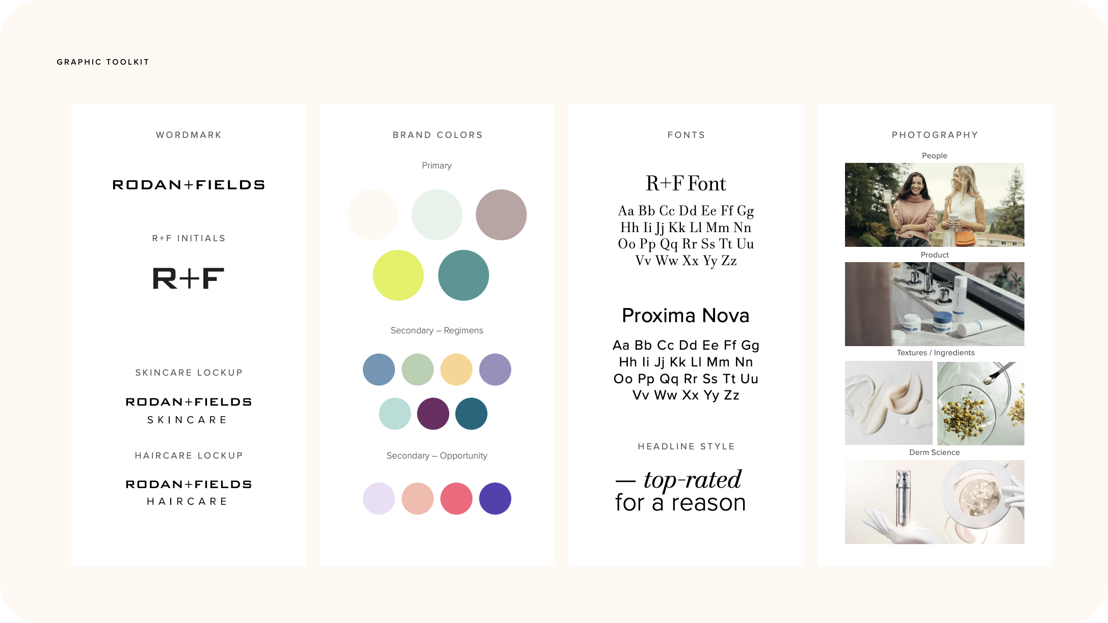
We leveraged core colors and assets provided by the Creative team in our design to create high-fidelity visuals.
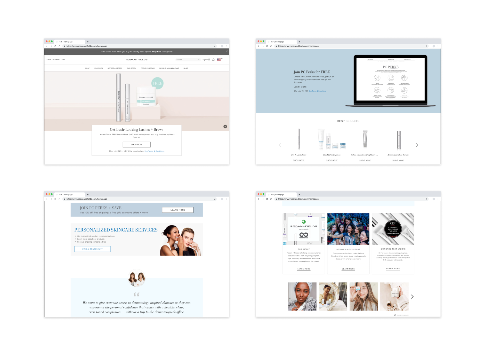
New Features
We moved the Best Seller module up the page into the second position below the hero module so users could quickly discover the product offerings. Users could also see new arrivals and promotions to inspire browsing and deep dive into product pages. We added “shop by concern” and promotion modules to help users navigate to the product suitable for their needs.
We also added more carousels to mobile breakpoints so users could see essential information with minimal scrolling and risking turning people off from exploring. We increased the size and added product descriptions to the product cards so users could easily read the benefits and select the item.
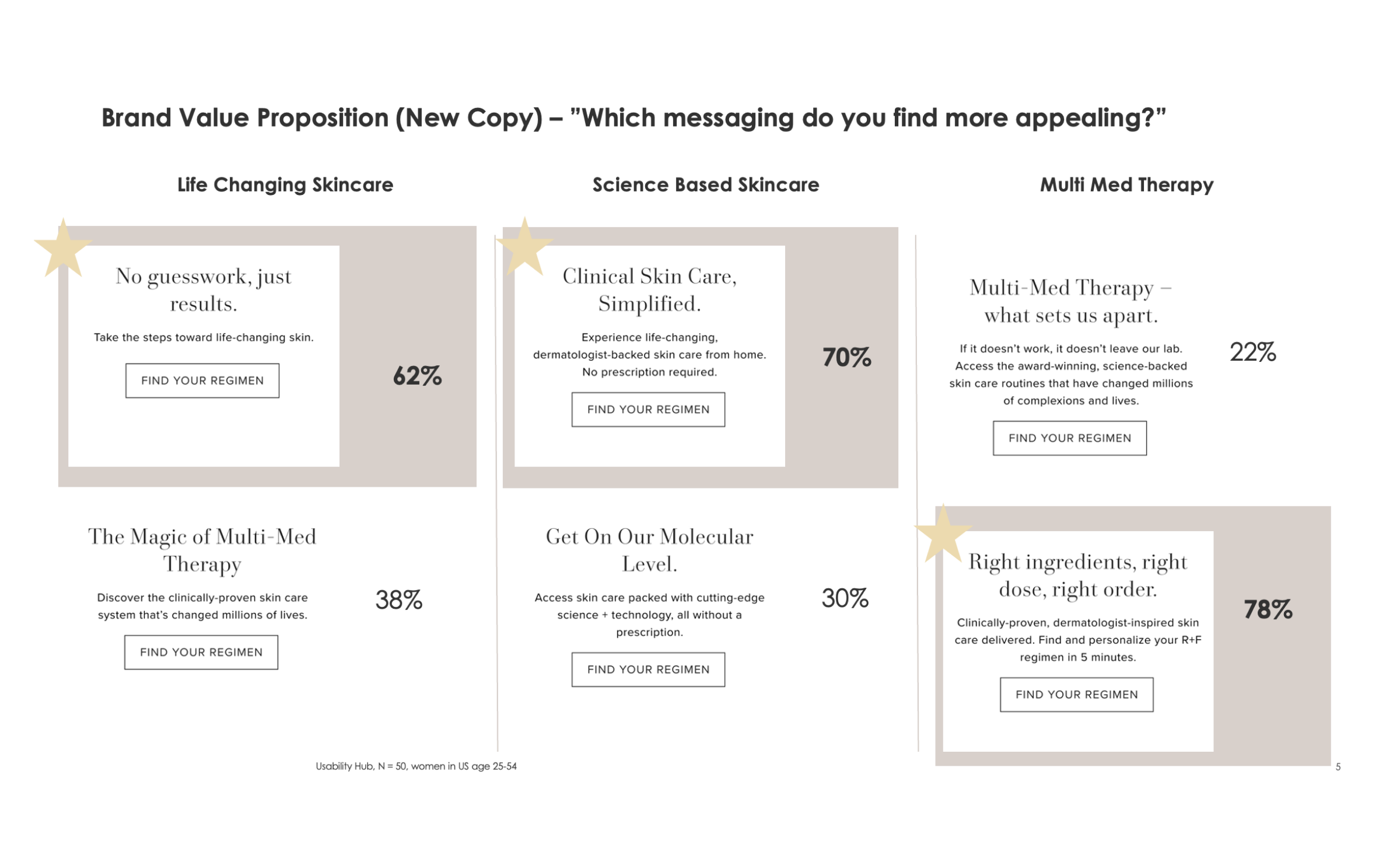
Usability Testing
We continue to A/B test the homepage to optimize module hierarchy and content. The example below highlights the A/B tests we ran to try image assets and copy for the hero module.
Scenarios
- Test image variations
- Test copy

Testing Results
For the content testing, the model/usage imagery outperformed static product imagery on both desktop and mobile. The clickthrough lift was strong (9% mobile, 30% desktop). The results for testing homepage banner CTA among 25K sessions showed visitors were slightly more engaged with the “Shop Now” CTA, but the difference was not statistically significant. We continue running CTA tests to build our knowledge of the optimized language.
Retrospect
What we'd do differently
It took a lot of work to accommodate all business asks in a short amount of time; we had to turn over designs quickly without sufficiently testing all modules. As a result, there were a few low-performing modules that we later refined or removed from the page. Communication across all departments about the page refresh was insufficient, causing delays in receiving final content and QA sign-off. Early socialization of the project would have eased a stressful turnaround.